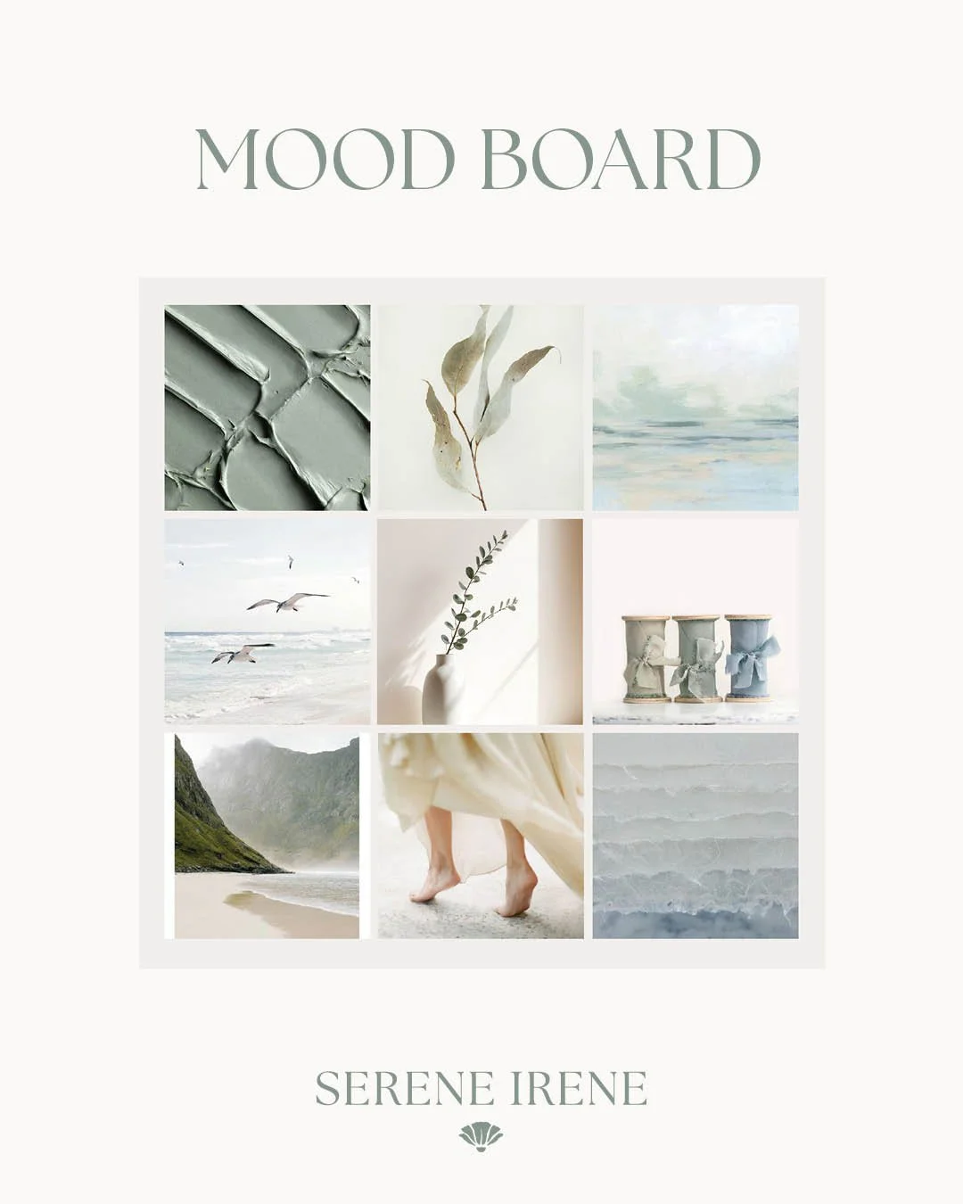
Color Palette and Mood for Serene Irene
When I first started dreaming up the visual identity for Serene Irene, I knew I wanted it to feel calm, grounded, and deeply connected to nature. I kept returning to the same colors in my mind — soft blues and gentle greens — the kinds of shades that remind me of the ocean, the sky, and new leaves in the spring.
Those early ideas became the heart of the brand’s color palette.
With the help of Amarie Lael Design, we brought it all together into a cohesive and soothing collection of colors that truly captures the spirit of Serene Irene.
The final palette features muted earth tones, misty blues, and soft sage greens — all chosen to create a quiet, relaxing feel. It’s a palette designed to mirror the kind of spaces and experiences I hope to help you create: peaceful, inspiring, and full of intention.
I’m so excited for you to see how these colors weave through everything we create here at Serene Irene.